
Twitter Bootstrap 4 alpha: what's new?
Bootstrap, a framework which every Front End Developer knows about. Now as @twbs team has announced the v4 alpha, there are many things that can be hoped


Bootstrap, a framework which every Front End Developer knows about. It has become a new requirement in various organizations for Front End Development positions. And why not; it has many things to offer both Developers and Organizations.
But now as @twbs team has announced the Twitter Bootstrap 4 alpha, there are many things that can be hoped about. And like previous upgrade from v2 to v3; where many things were simplified, same has been done.
The things that have been dropped are:
- Panels
- Thumbnails
- Wells
- Justified Navs
And the new things that have been added are:
| Component | Description |
|---|---|
| Cards | New, more flexible component to replace v3’s panels, thumbnails, and wells. |
| New navbar | Replaces the previous navbar with a new, simpler component. |
| New progress bars | Replaces the old .progress <div> with a real `progress` element. |
| New table variants | |
| New utility classes |
Cards; The Show Stopper:
As the team has stated Cards as replacement for Panels, Wells and Thumbnails; and it proves itself as the replacement of these. And believe; its not just the replacement, its more than that. The current doc page http://v4-alpha.getbootstrap.com/components/card/ demonstrates it very well.
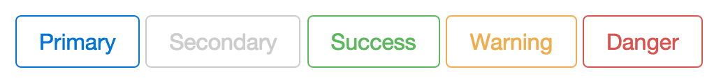
Buttons
Buttons are with an enhancement, buttons with outline. Using class .button-*-outline buttons can be outlined. * is the context here, i.e. success, info, warning, danger etc. Following snap shows an example of that:
The new things in Utility classes are:
Margin Utility
Now there are some classes to remove margins from elements with the help of following classes:
| Class | Description |
|---|---|
| .margin-a-0 | make all 4 sides margin to 0 |
| .margin-t-0 | make margin-top 0 |
| .margin-r-0 | make margin-right 0 |
| .margin-b-0 | make margin-bottom 0 |
| .margin-l-0 | make margin-left 0 |
| .margin-x-0 | make margin-left and margin-right 0 |
| .margin-y-0 | make margin-top and margin-bottom 0 |
Table Variants
The table variants have been added like:
- .table-inverse: Invert the table colors, add this class to
theadand onlytheadcolors will be inverted. - Contextual Classes: Add contextual classes like
table-success,table-dangeretc ontrortdto create contextual content - .table-reflow: Changes the table’s horizontal stacking to vertical or vice versa.
Scale Units
Now every scaling unit is written in em and rem.
Grid
The grid has 12 columns and the breakpoints have been increased to 5. They are
| Class Mid-fix | Scale | Description |
|---|---|---|
| xs | 0 | Extra small screen / phone |
| sm | 34em | Small screen / phone |
| md | 48em | Medium screen / tablet |
| lg | 62em | Large screen / desktop |
| xl | 75em | Extra large screen / wide desktop |
| Extra small <34em | Small≥34em | Medium≥48em | Large ≥62em | Extra large≥75em | |
|---|---|---|---|---|---|
| Grid behavior | Horizontal at all times | Collapsed to start, horizontal above breakpoints | |||
| Container width | None (auto) | 34rem | 45rem | 60rem | 72.25rem |
| Class prefix | .col-xs- | .col-sm- | .col-md- | .col-lg- | .col-xl- |
| # of columns | 12 | ||||
| Gutter width | 30px (15px on each side of a column) | ||||
| Nestable | Yes | ||||
| Offsets | Yes | ||||
| Column ordering | Yes | ||||
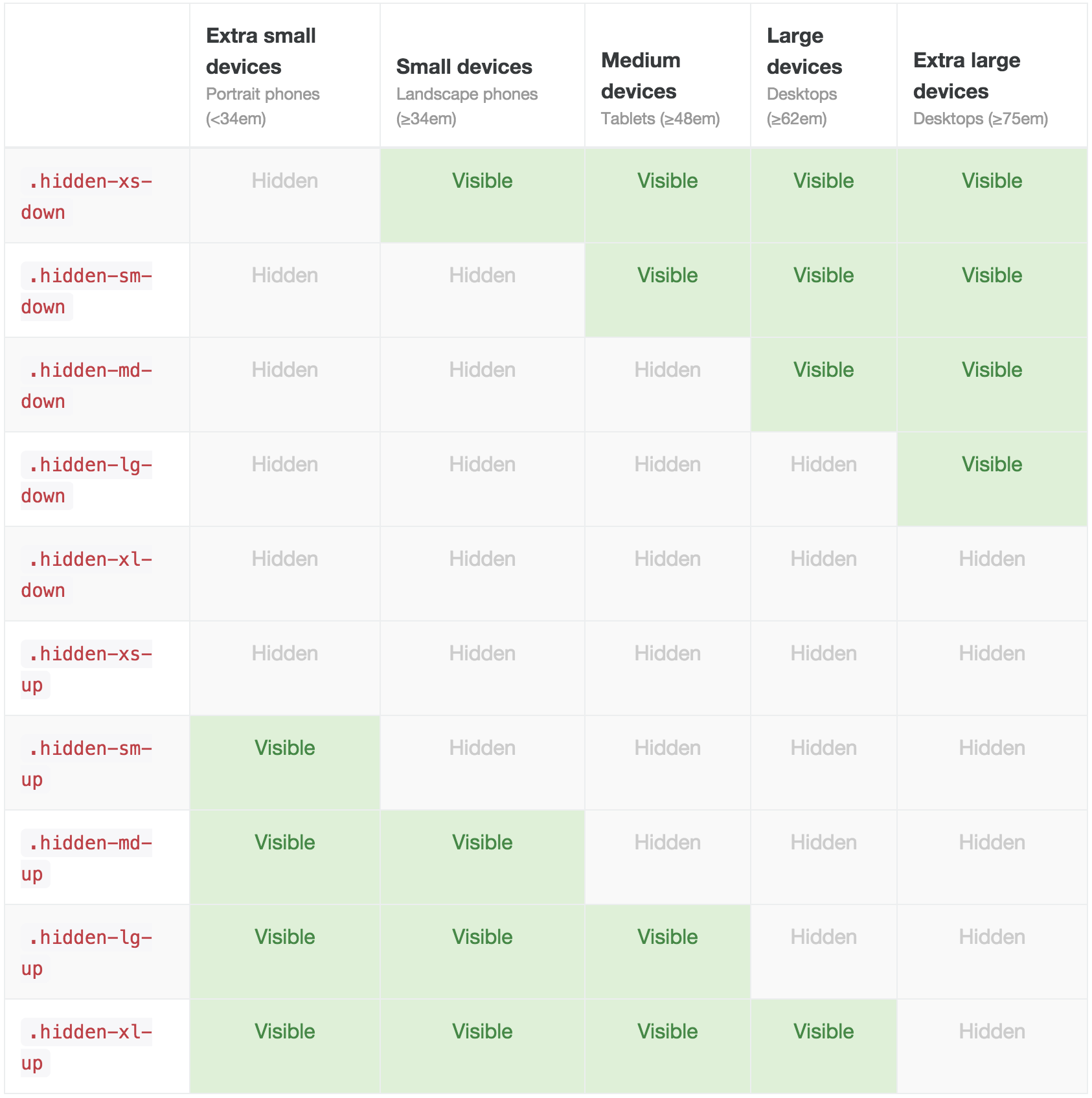
Responsive Utilities
- hidden-*-up: Hide any element with this class in
*and above breakpoints.*is a Class mid-fix previous Grid Section - hidden-*-dow: Hide any element with this class in
*and below breakpoints.*is a Class mid-fix previous Grid Section - No Visible/Show Class: Use hidden--up or hidden--down classes to fulfill this i.e.
.hidden-sm-down.hidden-xl-upshows element onmdandlgbreakpoints
Following Illustration depicts these classes’ use very clearly:
Some print helper classes are also added:
| Class | Description |
|---|---|
| .visible-print-block | Visible on print as display: block) |
| .visible-print-inline | Visible on print as display: inline) |
| .visible-print-inline-block | Visible on print as display: inline-block) |
| .hidden-print | Visible or browser but hidden on print |
Following illustration shows this properly:
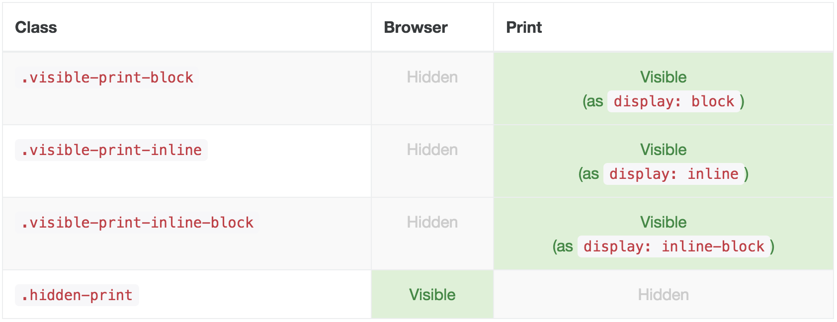
Image Helpers
- .img-responsive: This will apply
width: 100%; height: auto;on the image with this class - .center-block: This will center and display as block images with this class
This was an observation of ours on the current documentation of Bootstrap 4, which can be found here: http://v4-alpha.getbootstrap.com/. And it can also be downloaded from here.
Let us know about your views on this.